OUR DESIGN METHODOLOGY
To tell the story of volcanic eruptions in a meaningful and
accessible way, we began with a trusted scientific source: the
volcano dataset provided by
NOAA – National Centers for Environmental Information
(National Oceanic and Atmospheric Administration).
DATA ORGANIZATION
We first restructured the dataset into three thematic
macro-categories:
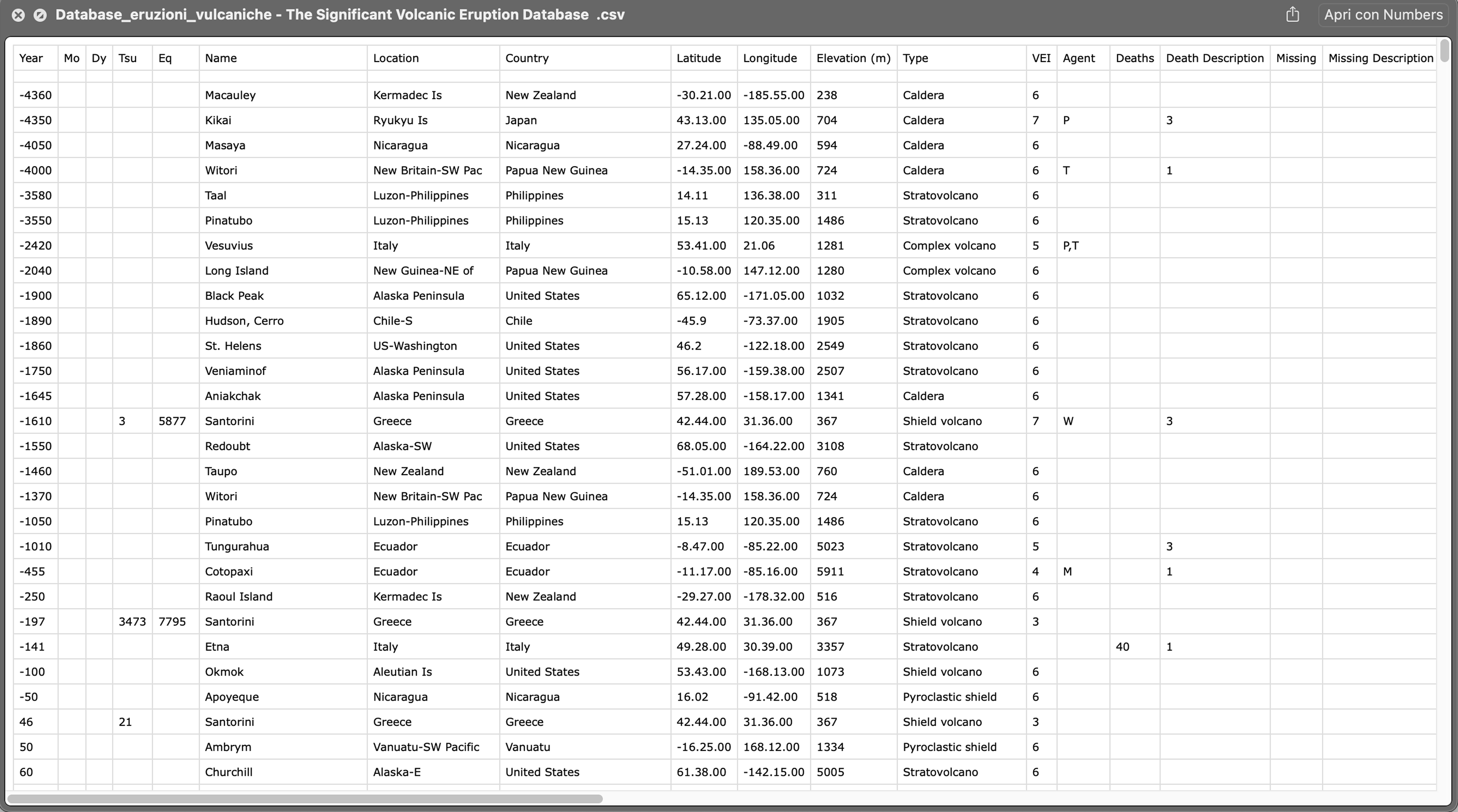
- CORE INFORMATION - Volcano name, eruption date, geographic location
- SECONDARY DETAILS - Volcano type, historical context
- IMPACT METRICS - Human, structural, and economic effects
Based on this structure, we defined two complementary levels of
visualization:
- An OVERVIEW to quickly compare eruptions at a glance
- A DETAILED VIEW to explore individual events in depth
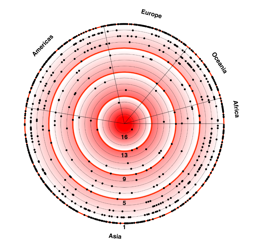
OVERVIEW VISUALIZATION
In the overview, each eruption is represented by four key
elements:
- YEAR AND TIME PERIOD of the event
- NAME OF THE VOLCANO
- VEI (VOLCANIC EXPLOSIVITY INDEX)
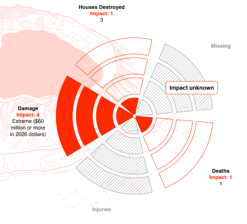
- OVERALL IMPACT SCORE, derived from five standardized impact categories
Each eruption receives a
TOTAL IMPACT SCORE by summing the
values across all five categories. This score ranges from
1 (MINIMAL IMPACT) to
20 (MAXIMUM SEVERITY), enabling
direct comparison between events.
IMPACT CATEGORIES
The impact categories are defined as follows:
| Category | Level 1 | Level 2 | Level 3 | Level 4 |
|---|---|---|---|---|
| Deaths | 1–50 | 51–100 | 101–1,000 | 1,001+ |
| Injuries | 1–50 | 51–100 | 101–1,000 | 1,001+ |
| Houses Destroyed | 1–50 | 51–100 | 101–1,000 | 1,001+ |
| Missing | 1–50 | 51–100 | 101–1,000 | 1,001+ |
| Economic Damage* | < $2.4 million (LIMITED) | $2.4–12 million (MODERATE) | $12–57.6 million (SEVERE) | ≥ $60 million (EXTREME) |
*For events without a monetary damage assessment, a four‑level
classification scale was applied, as shown in the “Damage”
column. When a dollar value was available, a descriptive label
was still included for research purposes. Where feasible, an
approximate monetary estimate was inferred from the description
to assign the appropriate category. Single descriptive terms
were mapped to categories based on their established usage in
comparable sources. In the absence of further detail, terms were
interpreted as follows: LIMITED (slight, minor, light),
MODERATE (medium‑level damage), SEVERE (major,
extensive, heavy), EXTREME (catastrophic).
Descriptive terms correspond to the 2026 dollar values.
Descriptive terms correspond to the 2026 dollar values.
DATA INTERPRETATION
In this chart, some segments may appear in gray with a hover
label reading
"NO DATA AVAILABLE." This
indicates that, for this specific eruption, the original dataset
lacks reliable information for that impact category—not that no
impact occurred, but that it was not documented or quantified in
the source.
Our approach to data interpretation emphasizes
TRANSPARENCY about data
limitations. When information is missing or uncertain, we
clearly indicate this to users rather than making assumptions or
interpolating values.
This methodology ensures that our visualizations remain both
SCIENTIFICALLY ACCURATE and
ETHICALLY RESPONSIBLE, providing
users with a clear understanding of both what we know and what
we don't know about each volcanic event.
VISUALIZATION PRINCIPLES
- CLARITY OVER COMPLEXITY - Prioritize understandable representations
- ACCURACY OVER AESTHETICS - Never sacrifice truth for visual appeal
- TRANSPARENCY OVER ASSUMPTION - Clearly indicate data gaps and limitations
- CONTEXT OVER ISOLATION - Show data in historical and geographical context
By adhering to these principles, we create visualizations that
are not only informative but also honest about the limitations
of the underlying data, allowing users to draw meaningful
conclusions while understanding the boundaries of what can be
known from the available information.